Bochka
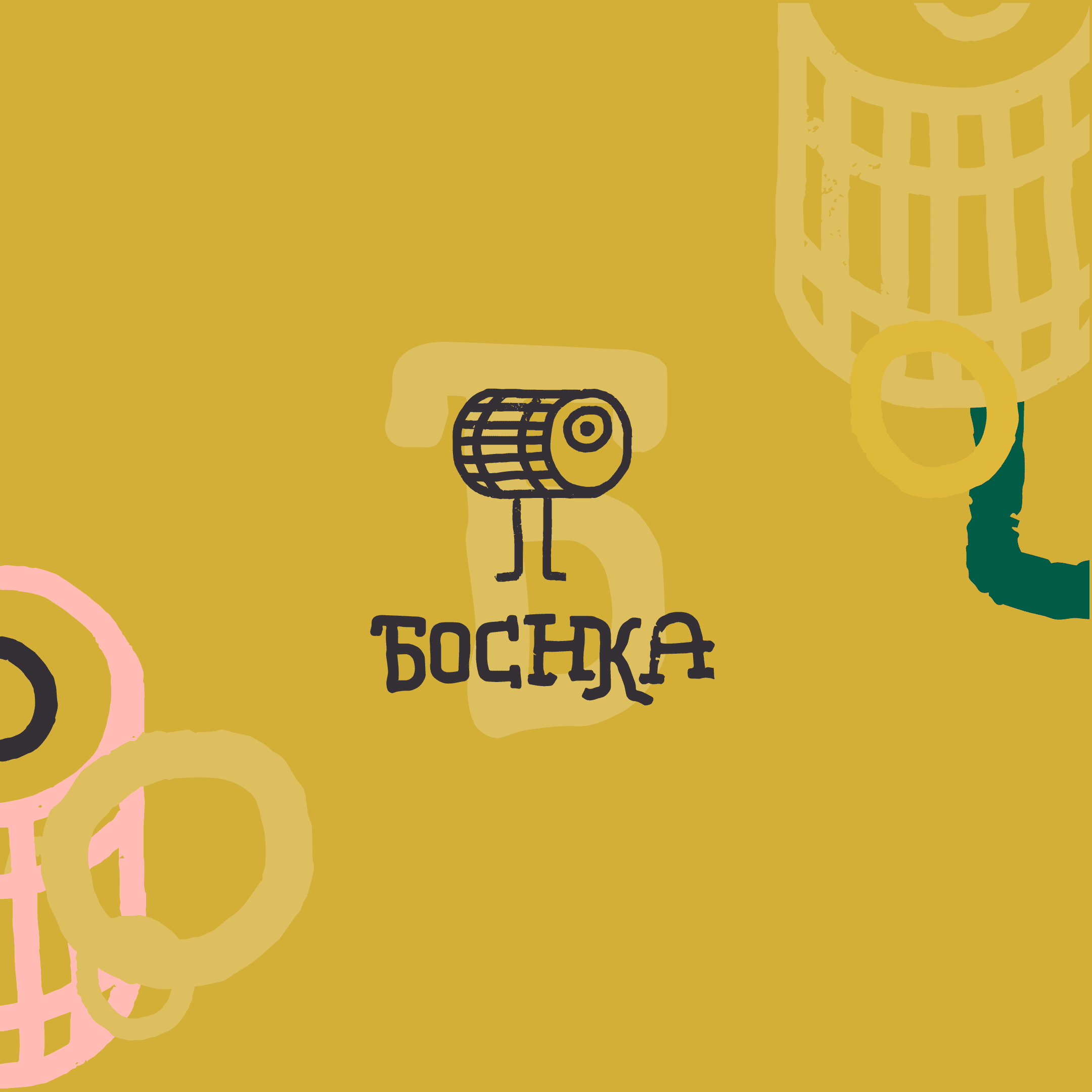
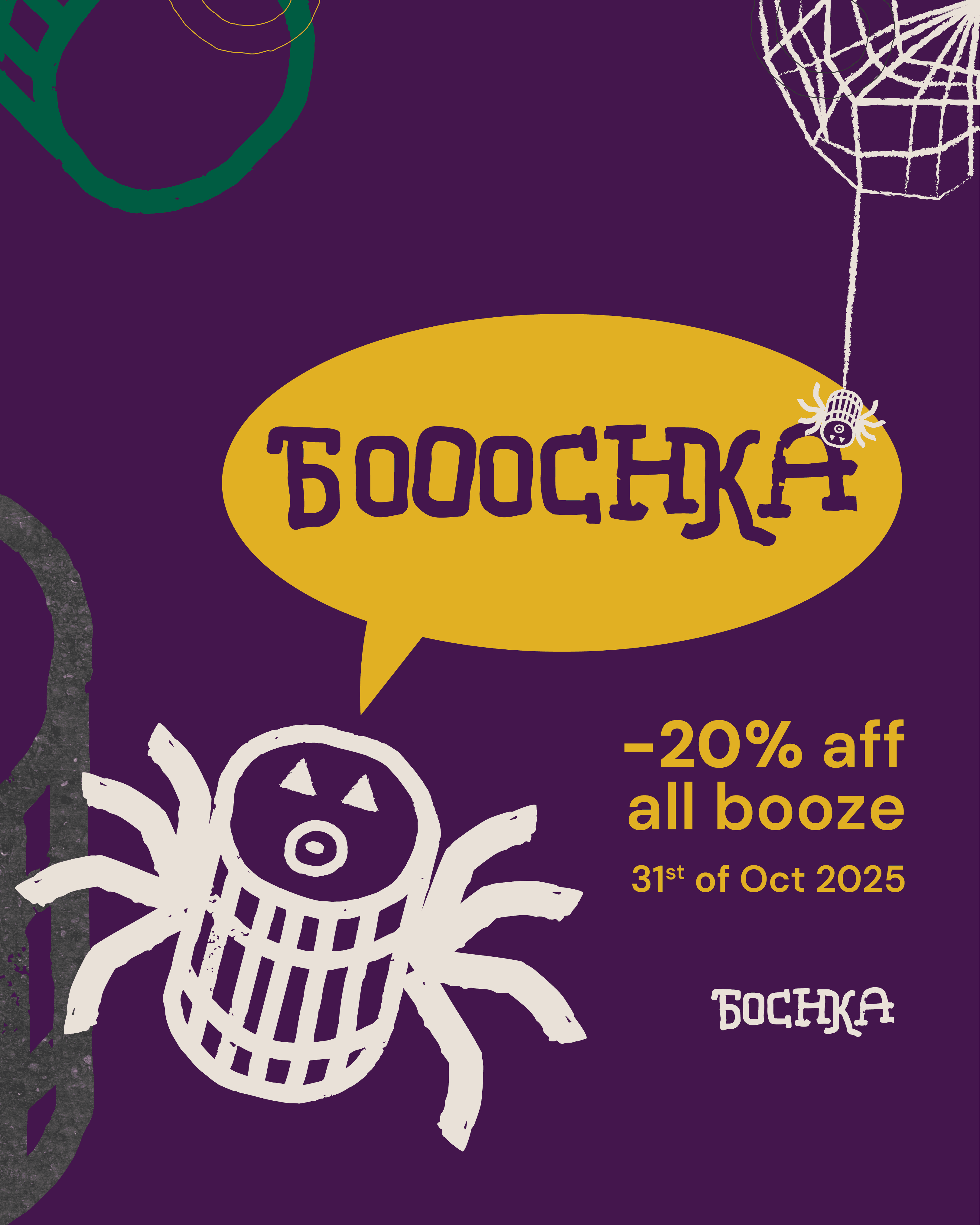
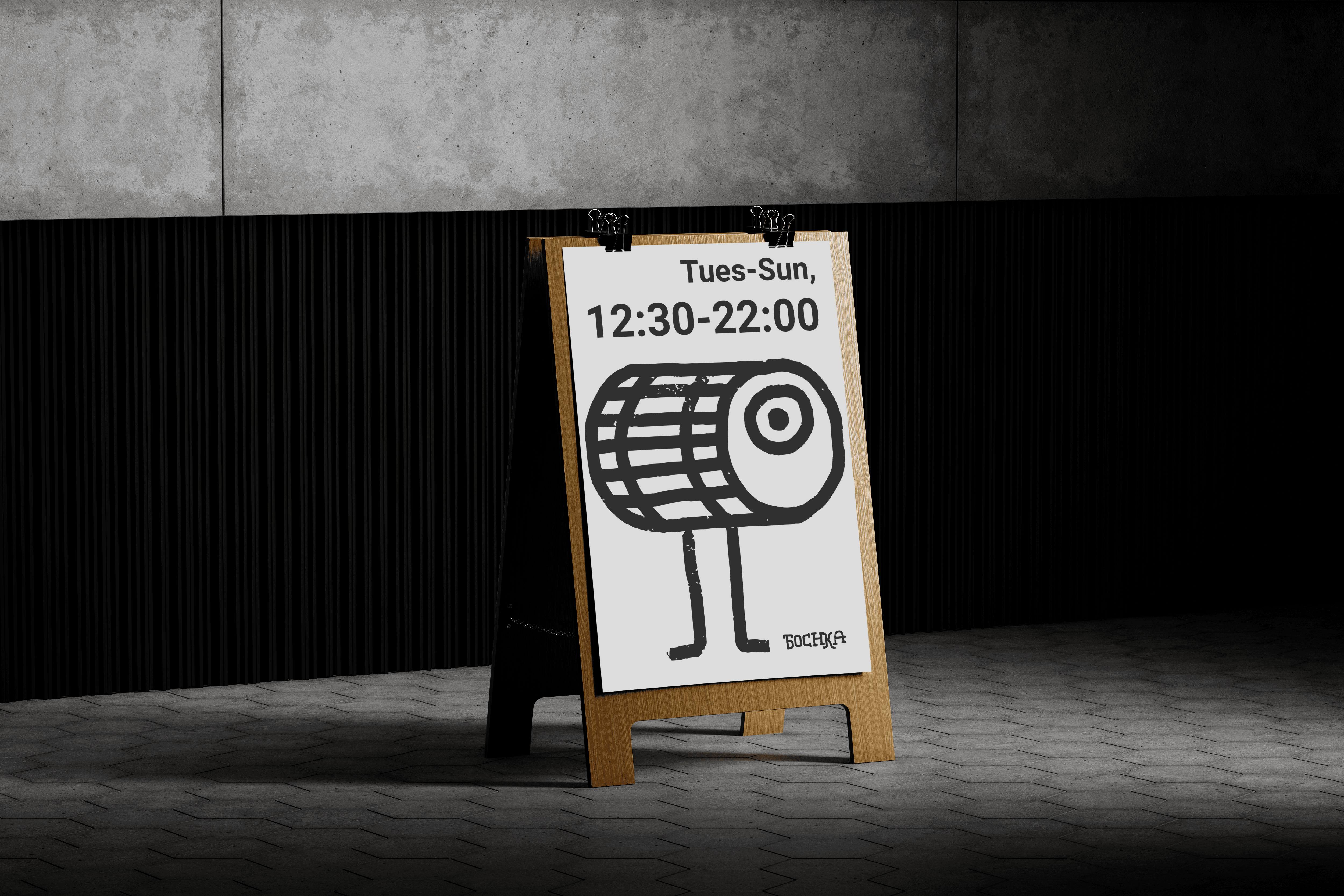
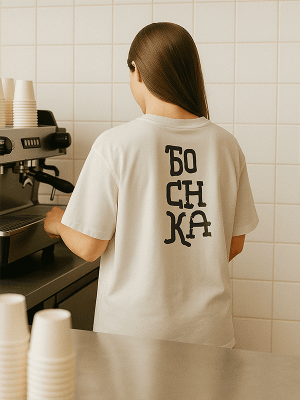
Bochka came out of Curious Liquids wanting a proper home for their beer and spirits, something with its own personality, separate from the wine shop next door. The ask was specific: keep the Cyrillic Б front and centre, nod to Eastern European roots, and make it feel loud and a bit rebellious rather than polished.
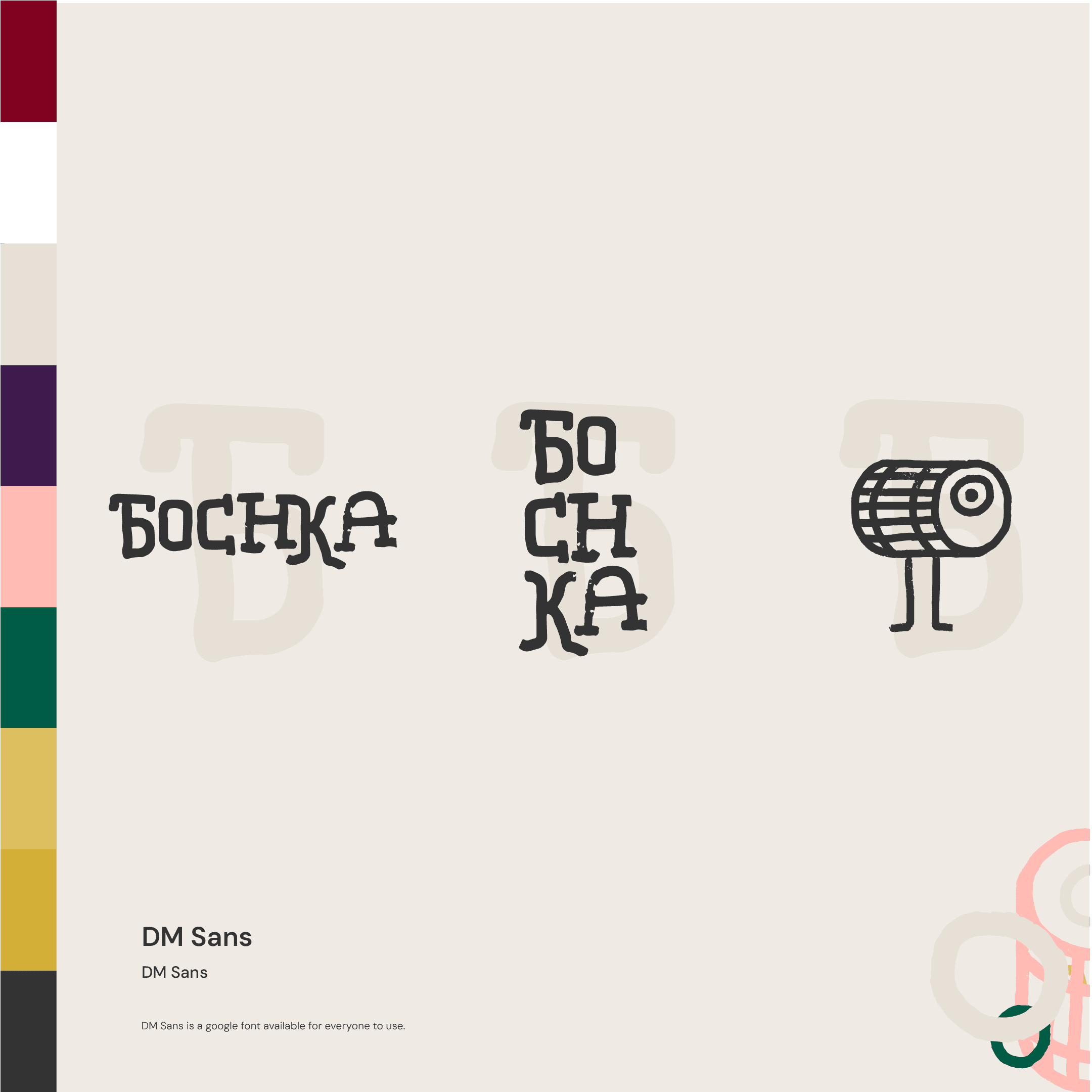
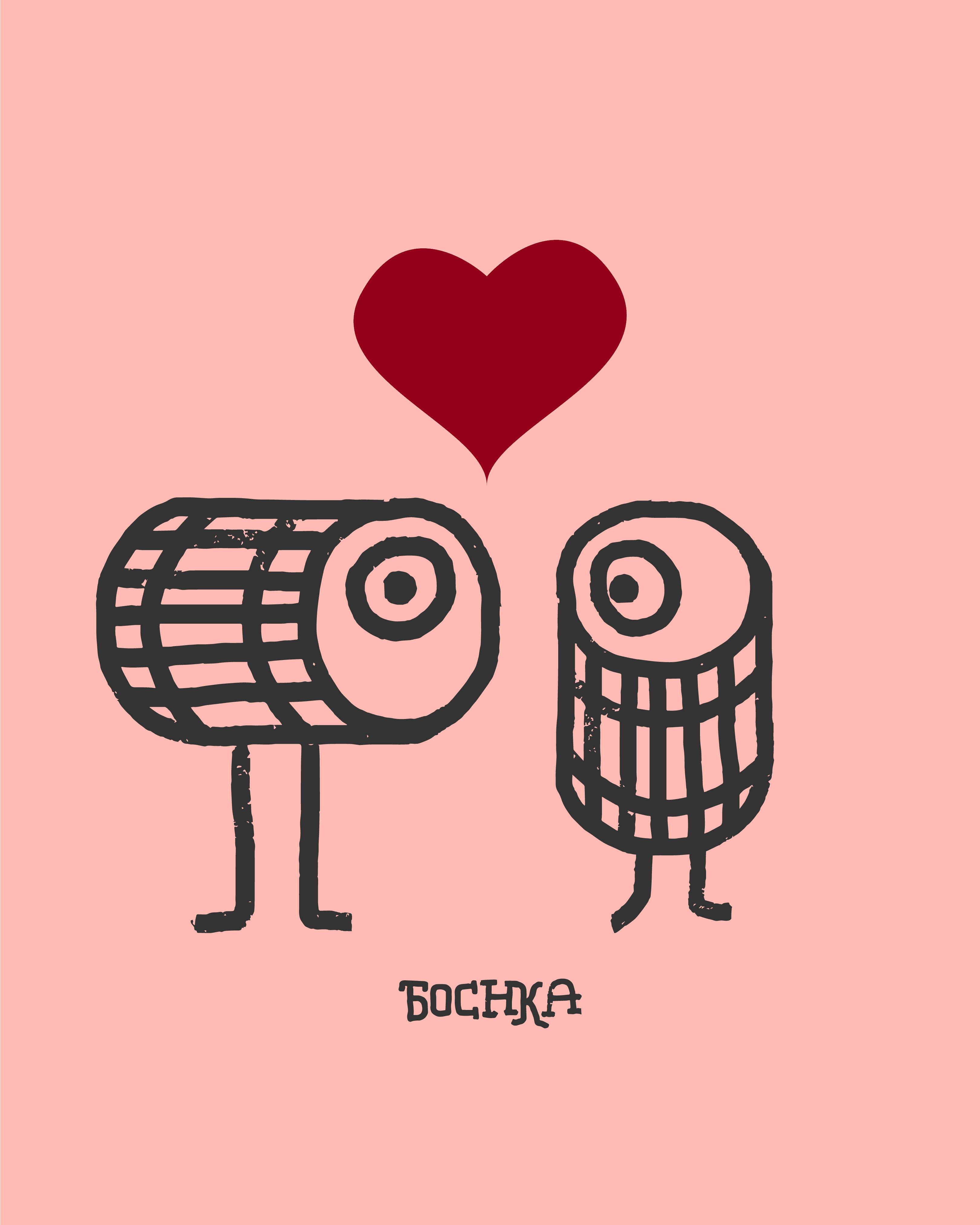
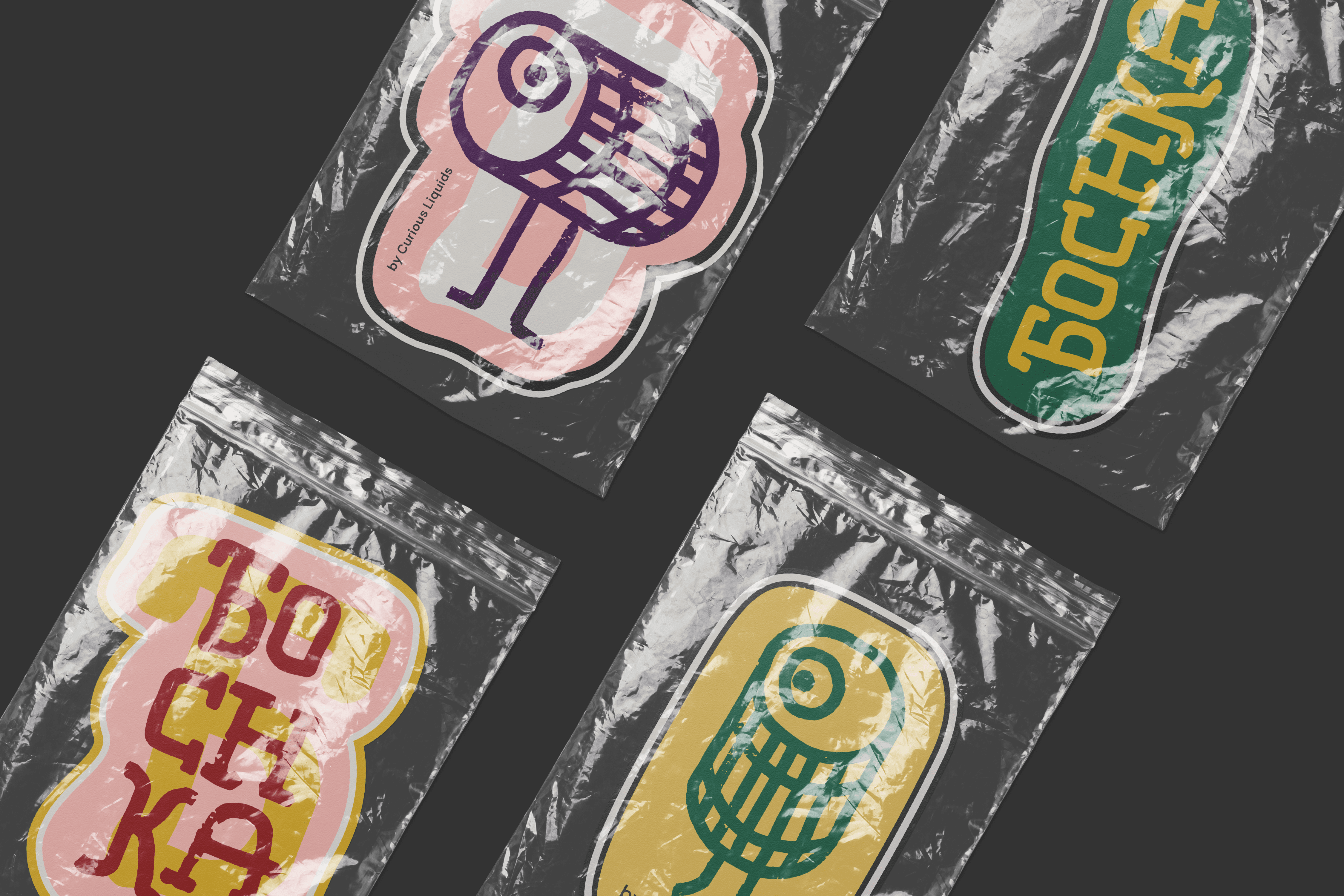
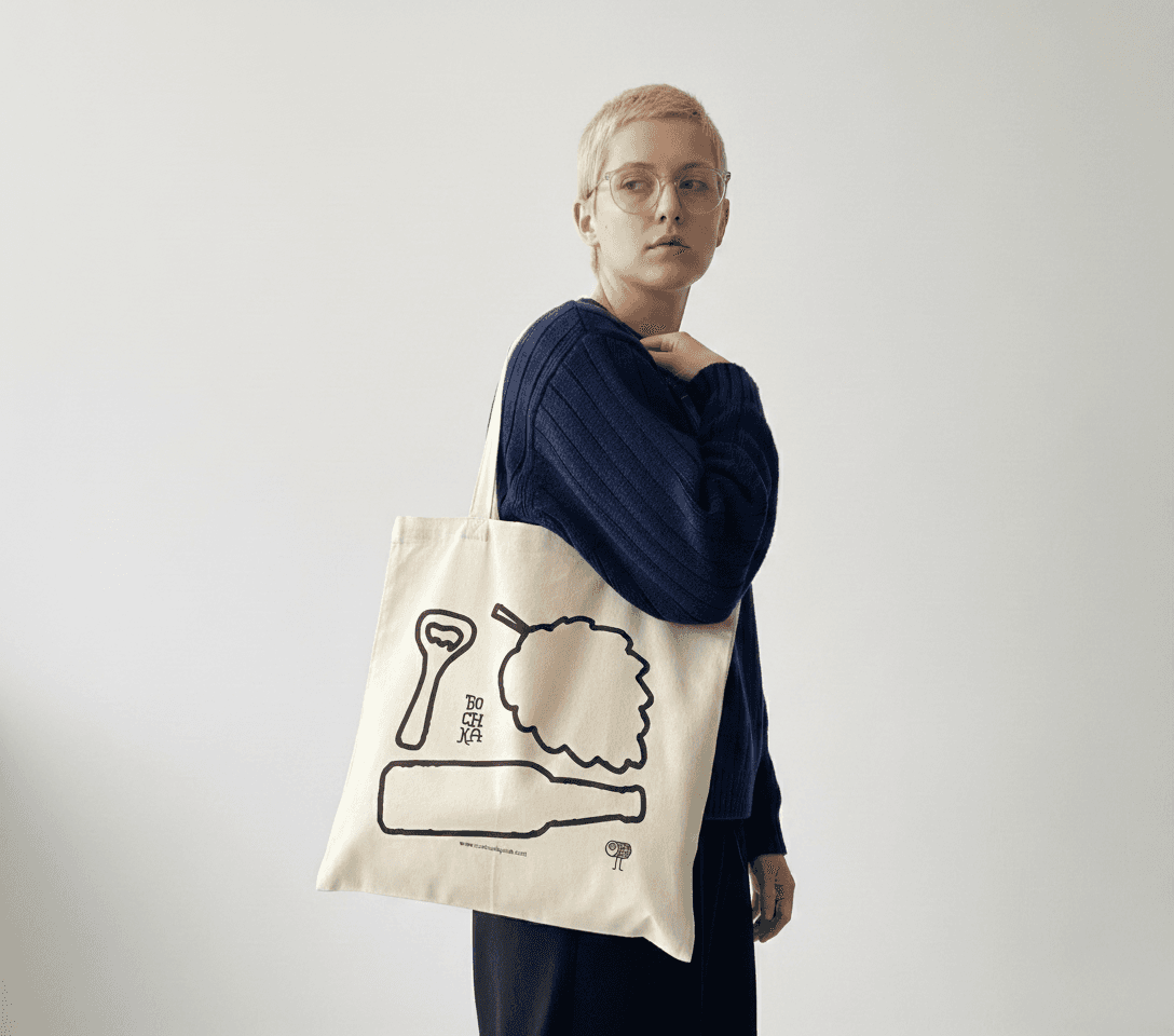
We built the whole identity from a hand-drawn starting point rather than a vector one. Every mark, logo included, was drawn first and refined after, so the line work keeps that slightly imperfect, human quality instead of looking machine-made. Colour, typography (pulling reference from vintage Slavic signage), and tone of voice all worked from the same brief: warmth and nostalgia, with an edge.
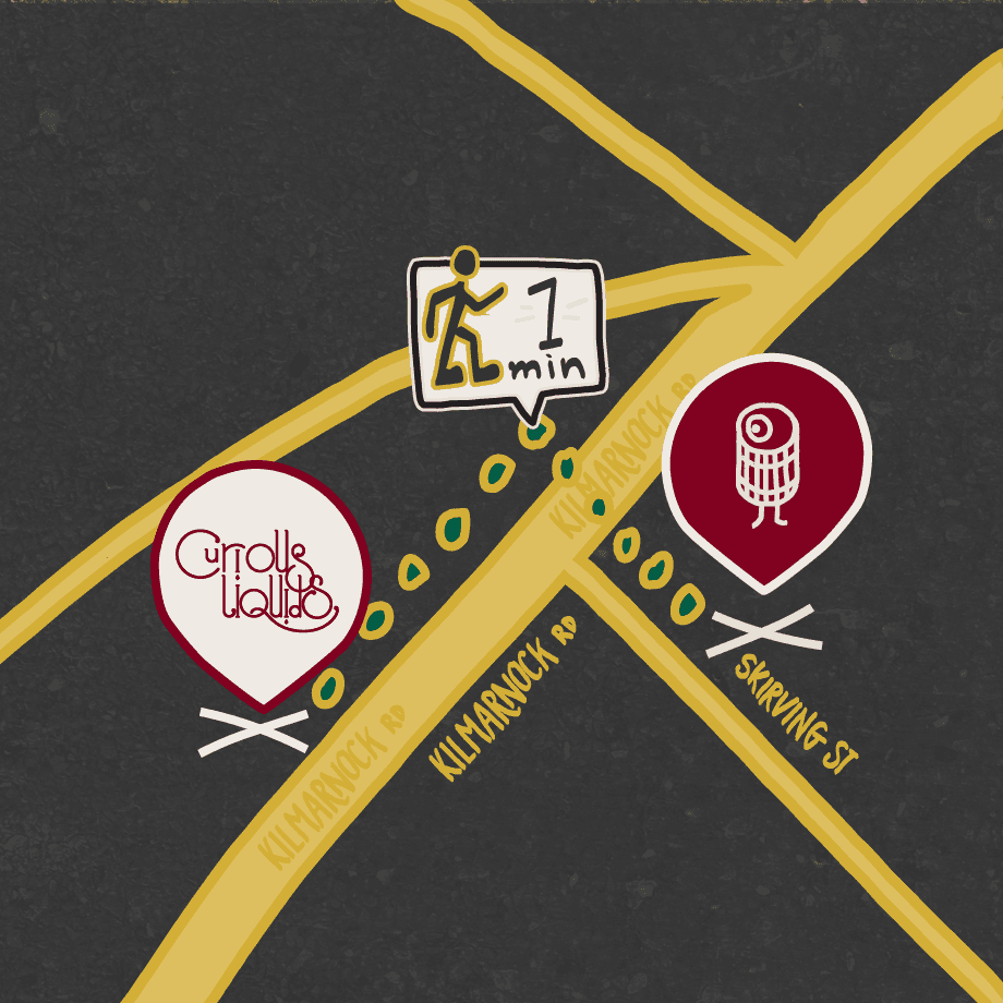
The two shops sit about 50 metres apart, a one-minute walk down the street from each other, so we drew a little hand-illustrated map showing the route between them. It's a small thing, but it ties the two spaces together without saying a word about it.
The detail I'm most fond of, though, is the receipt. We got the barrel motif onto it, so even the till roll carries a bit of the identity through. Nobody asks for that. It's the kind of touchpoint that only shows up if someone's actually paying attention the whole way through, not just at the logo stage.
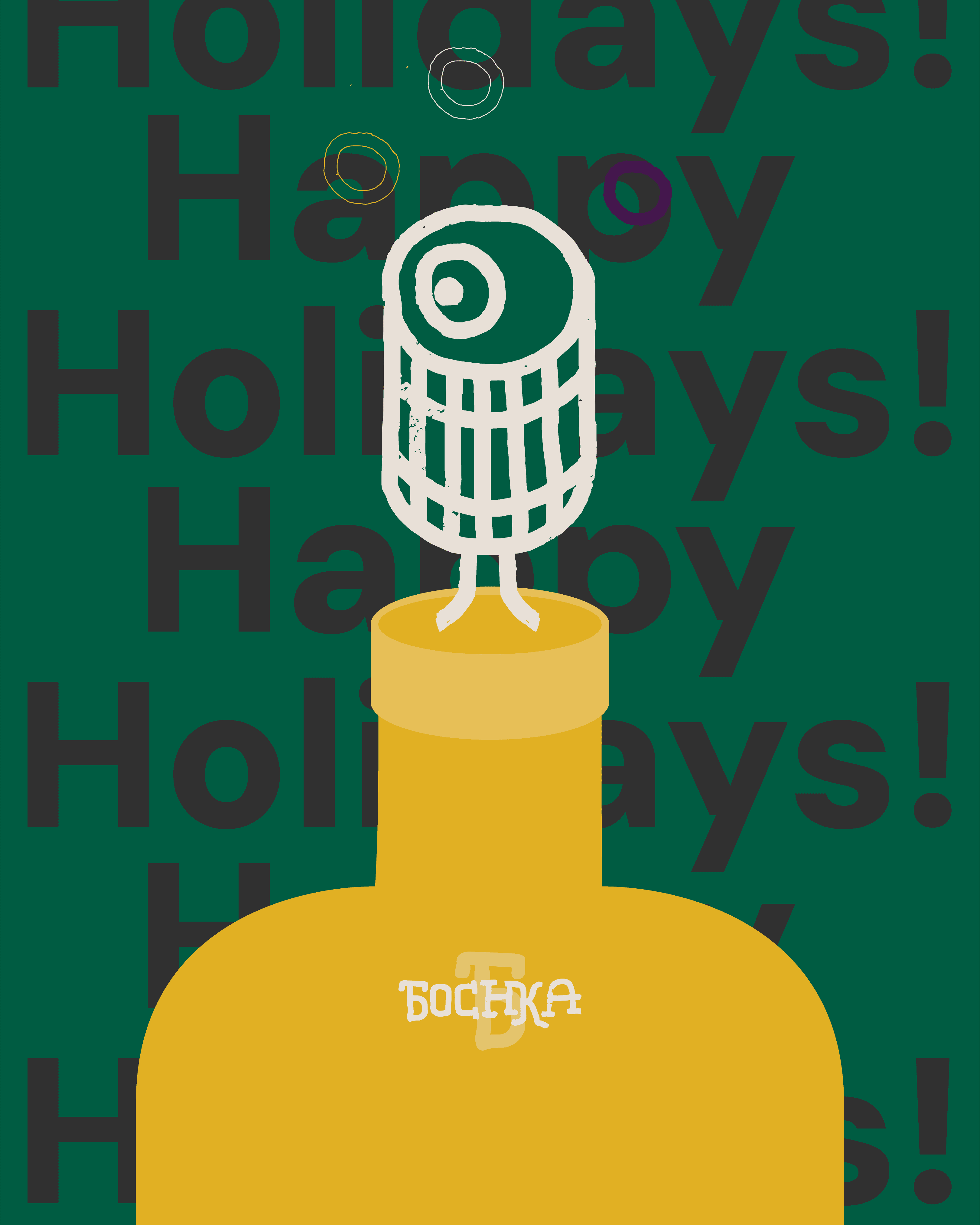
It's now sitting on the shelf in Shawlands, right alongside Curious Liquids, and it reads as its own thing entirely. Loud, specific, not trying to be anyone else.
Their new site just went live, have a wee browse here.