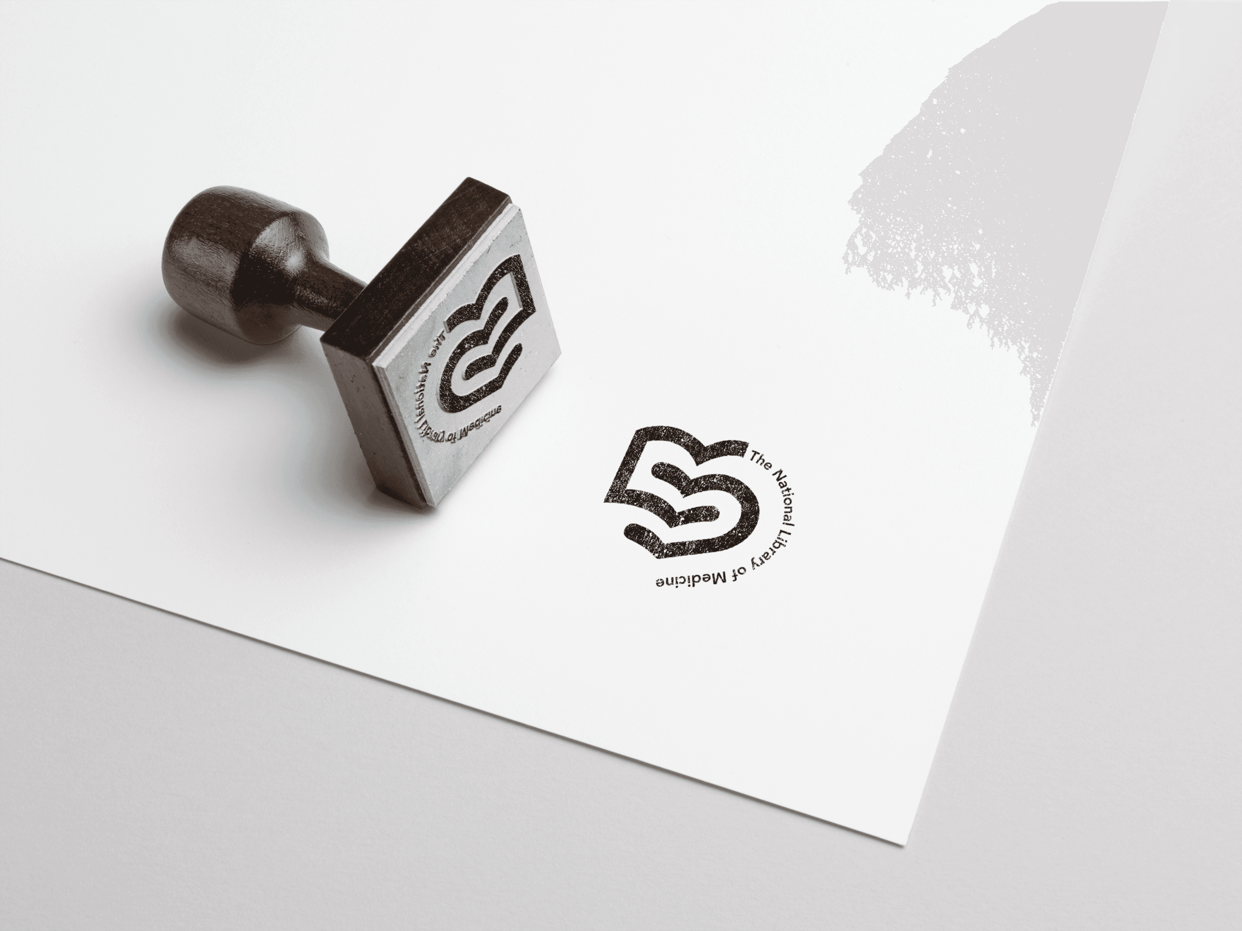
The National Medical Library
A national institution with decades of authority. And a look that hadn't kept up. The National Medical Library didn't need a facelift. It needed a visual language that could do two jobs at once: carry the weight of serious medical research, and still feel open to anyone who walks in or logs on. Respect the legacy. Lose the dust.
We went looking for inspiration in the Library's own world. Medical diagrams. Archival records. Things built to be understood at a glance.
What came out is minimal, but never anonymous.
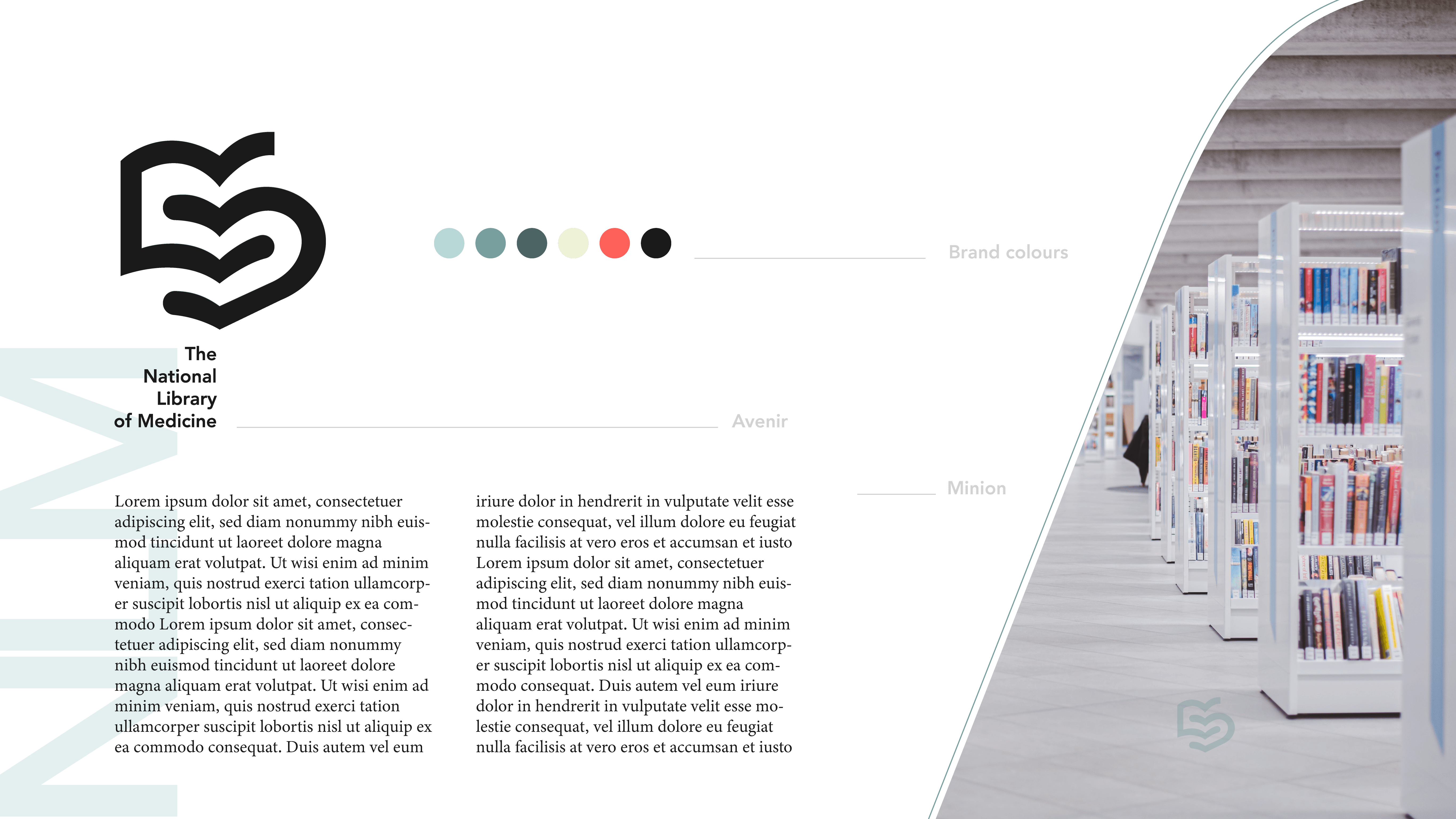
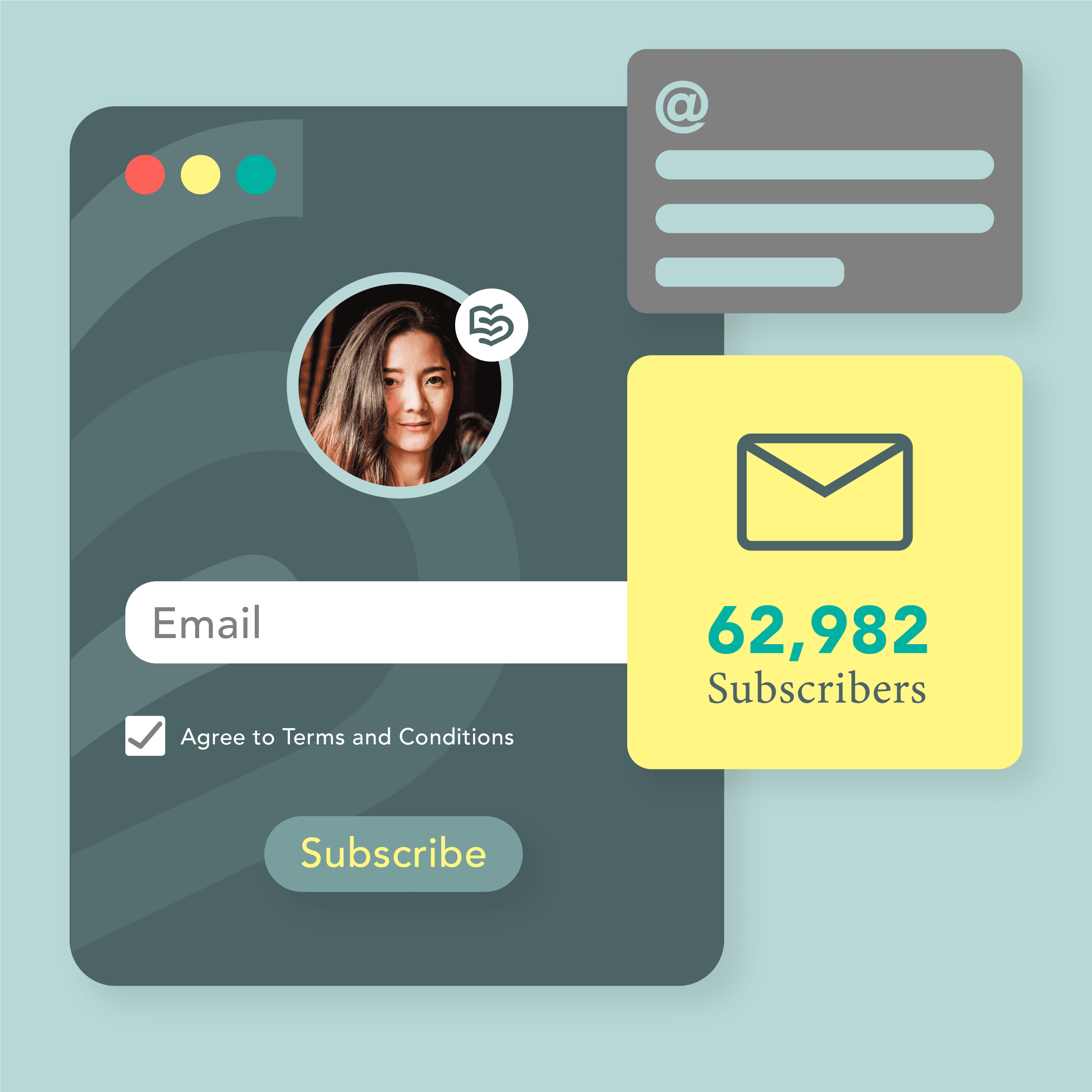
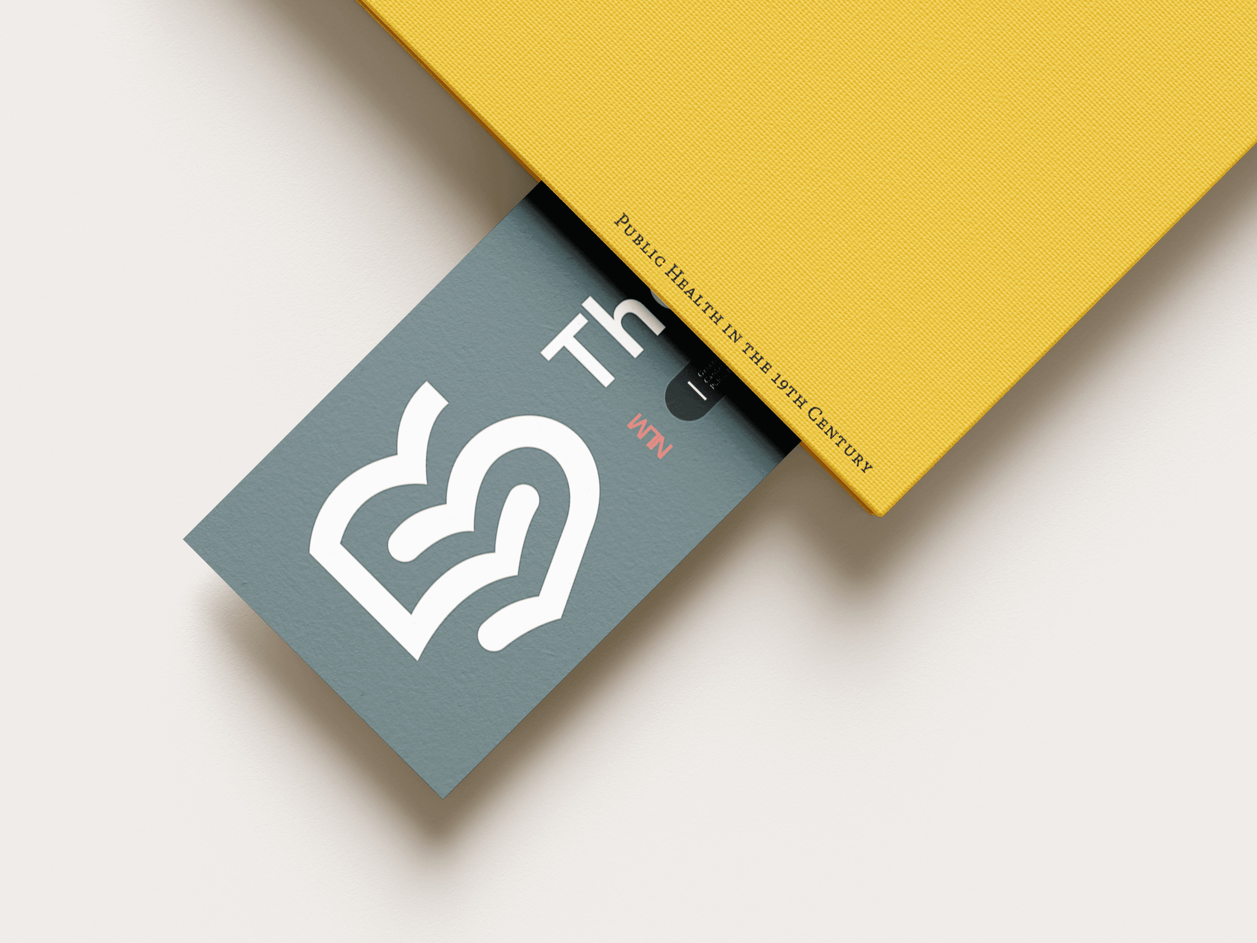
Neutral tones, sharpened with bold accent colours that signal clarity and trust. A clean typographic system that stays legible at every size, on every surface. Modular grids and icon-inspired motifs that quietly reflect how organised and data-driven the Library really is, without ever feeling clinical.
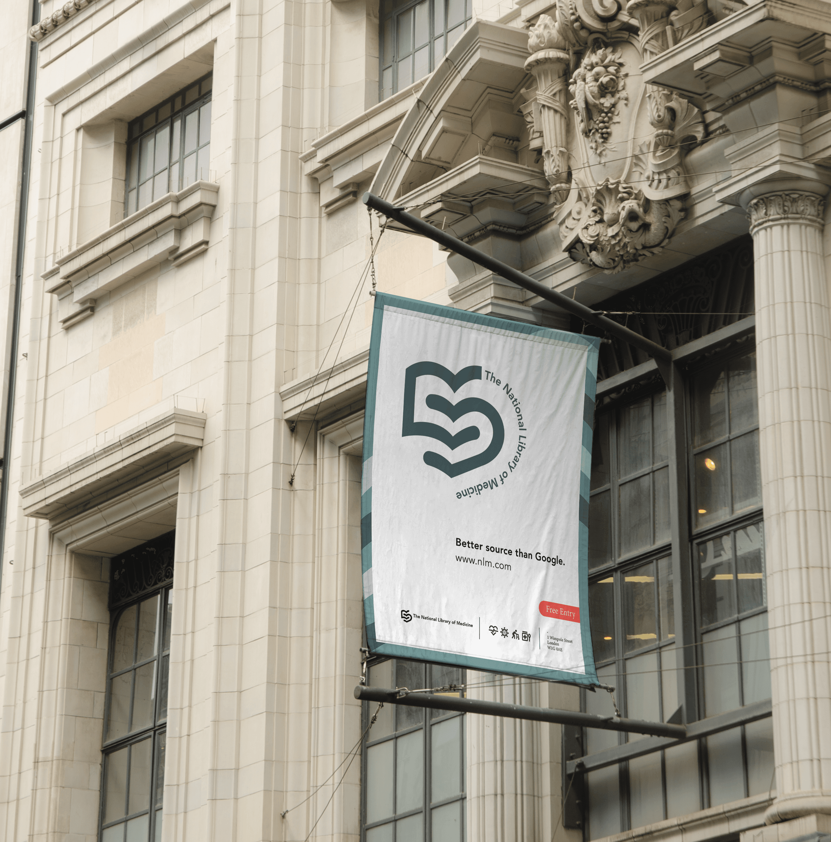
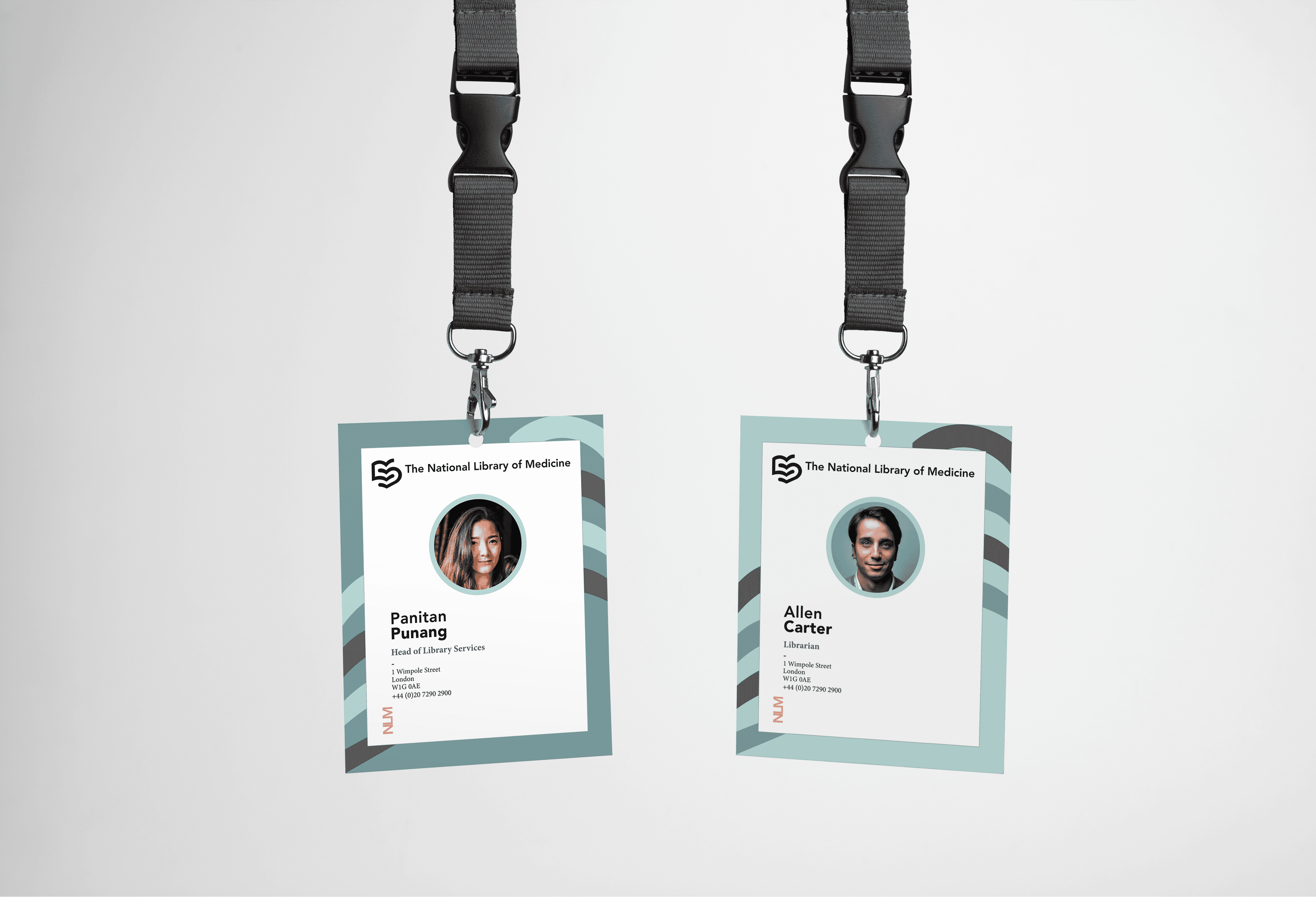
Editorial layouts. Digital platforms. Print. Signage.
One system, everywhere. Calm. Clear. Authoritative without raising its voice.
Proof that serious doesn't have to mean stiff.